BANK HAPOALIM - 2023
bit Terminal
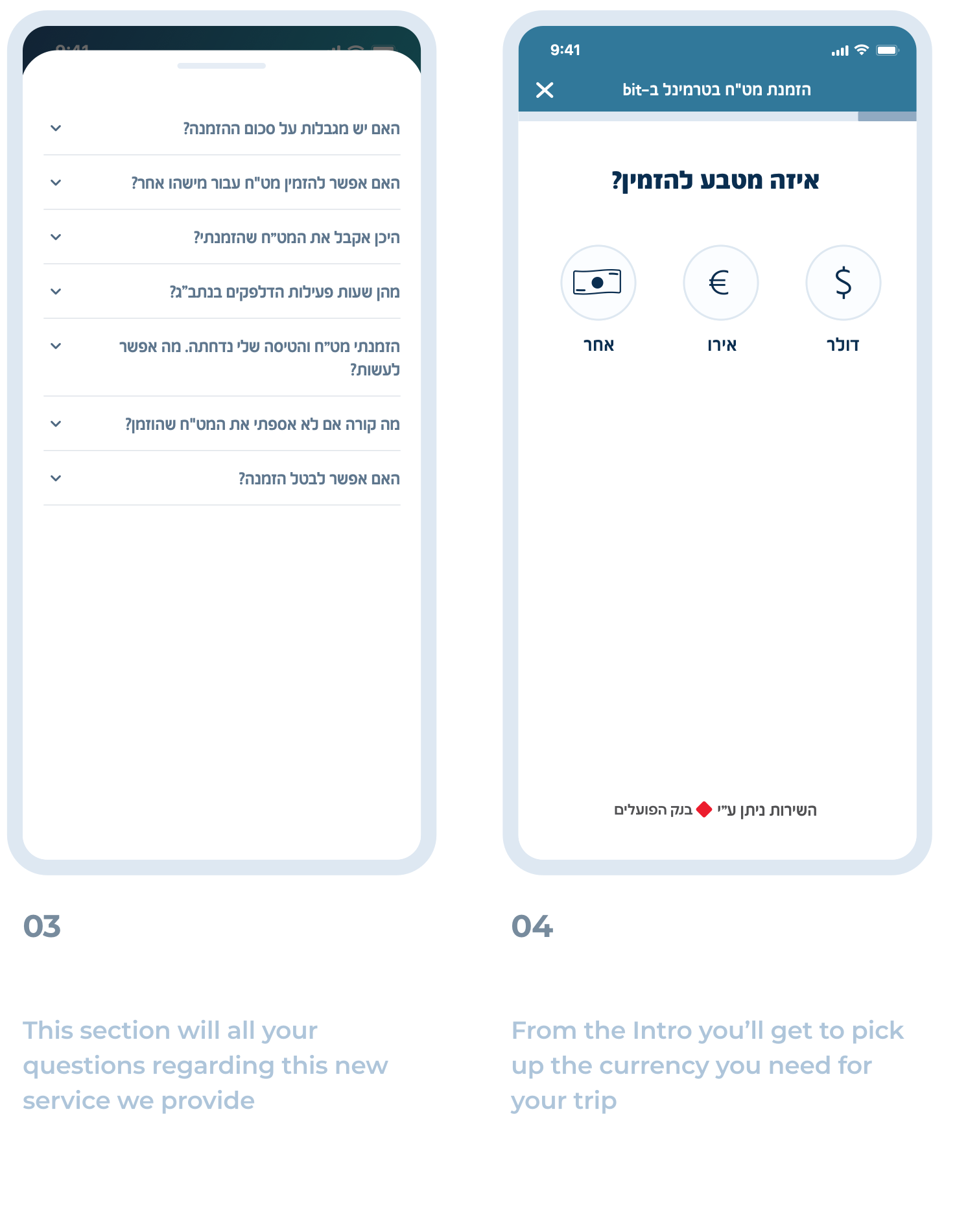
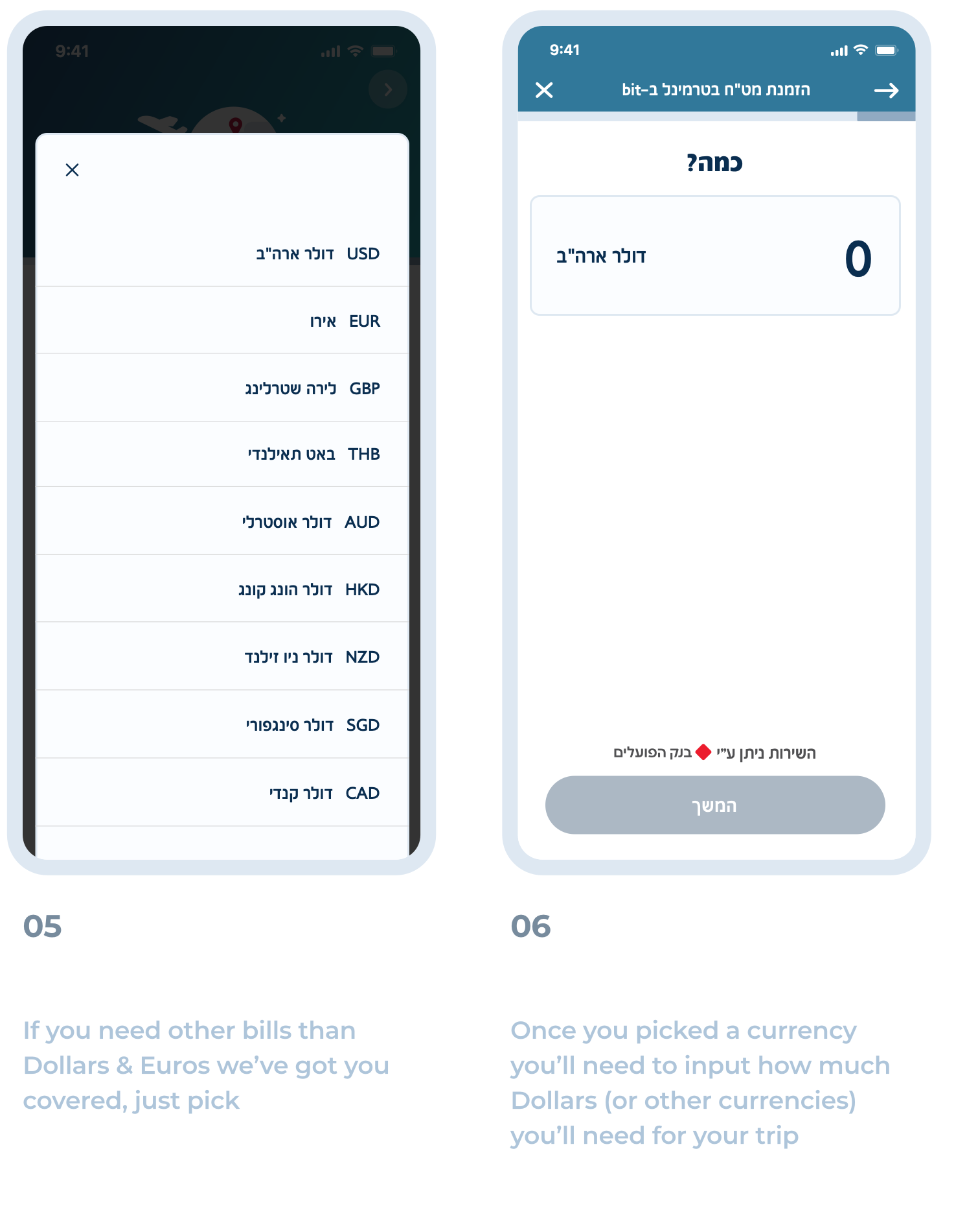
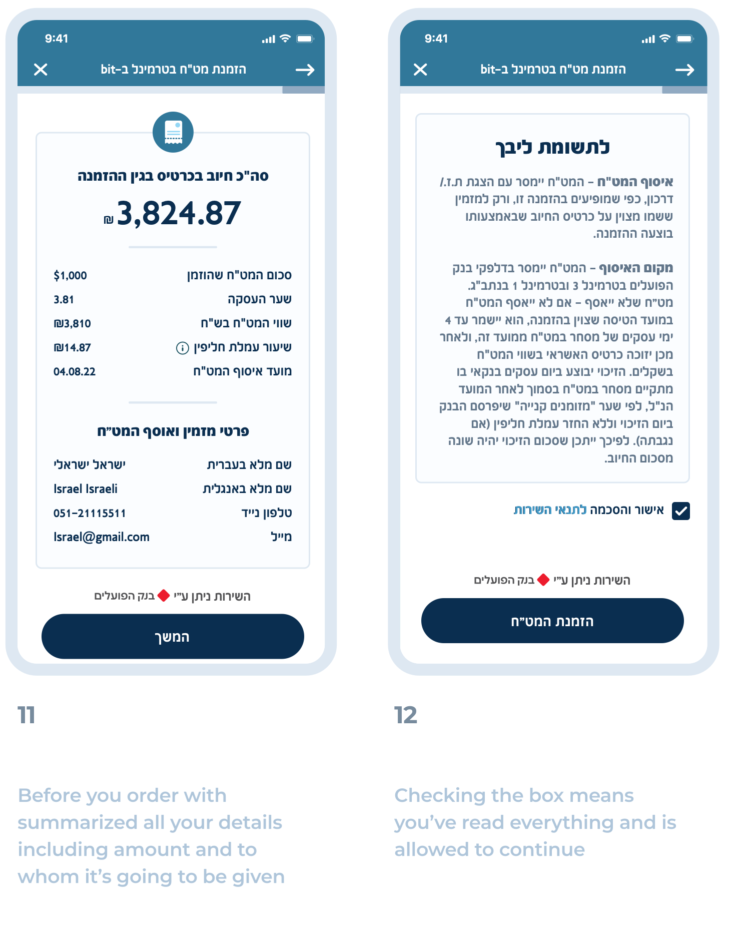
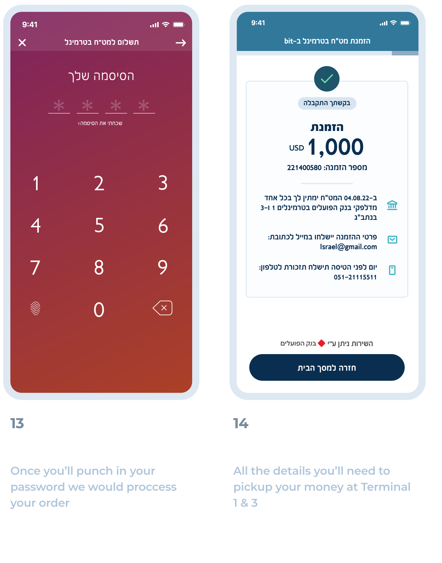
Booked a flight at the last minute? Well, now you can order how much & which cash you may need at Terminal 1 & 3🎉
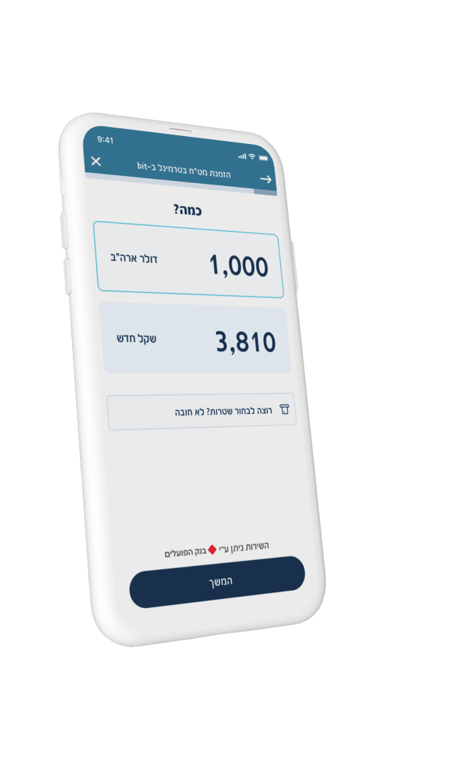
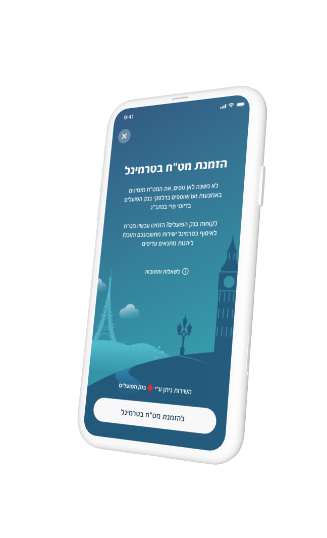
Overview
Bank Hapoalim has a service that allows users order foreign cash from Terminal Flights but it had several problems:
- It’s only available to its customers
- The UI is very outdated
- BH have 2 million users
bit on the other hand, has over 3 million active users which most of them aren’t Hapoalim customers so to make the service widely available it was decided to launch this service directly to bit.
The objectives:
- Increase sales
- Simplify the process to many users
- Quick win development-wise
Research Existing Solutions
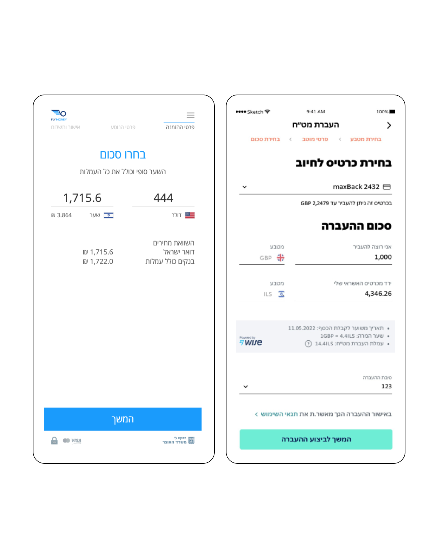
Bank Hapoalim wanted to add a currency transfer feature to their app, bit, so my first step was to review existing market solutions. Among the many options, I focused on these apps:
- Israelpost (Manually through their desktop)
- FlyMoney
- Max
By keeping in mind on what's available it was clear on what should we focus on to make a user-centric experience.
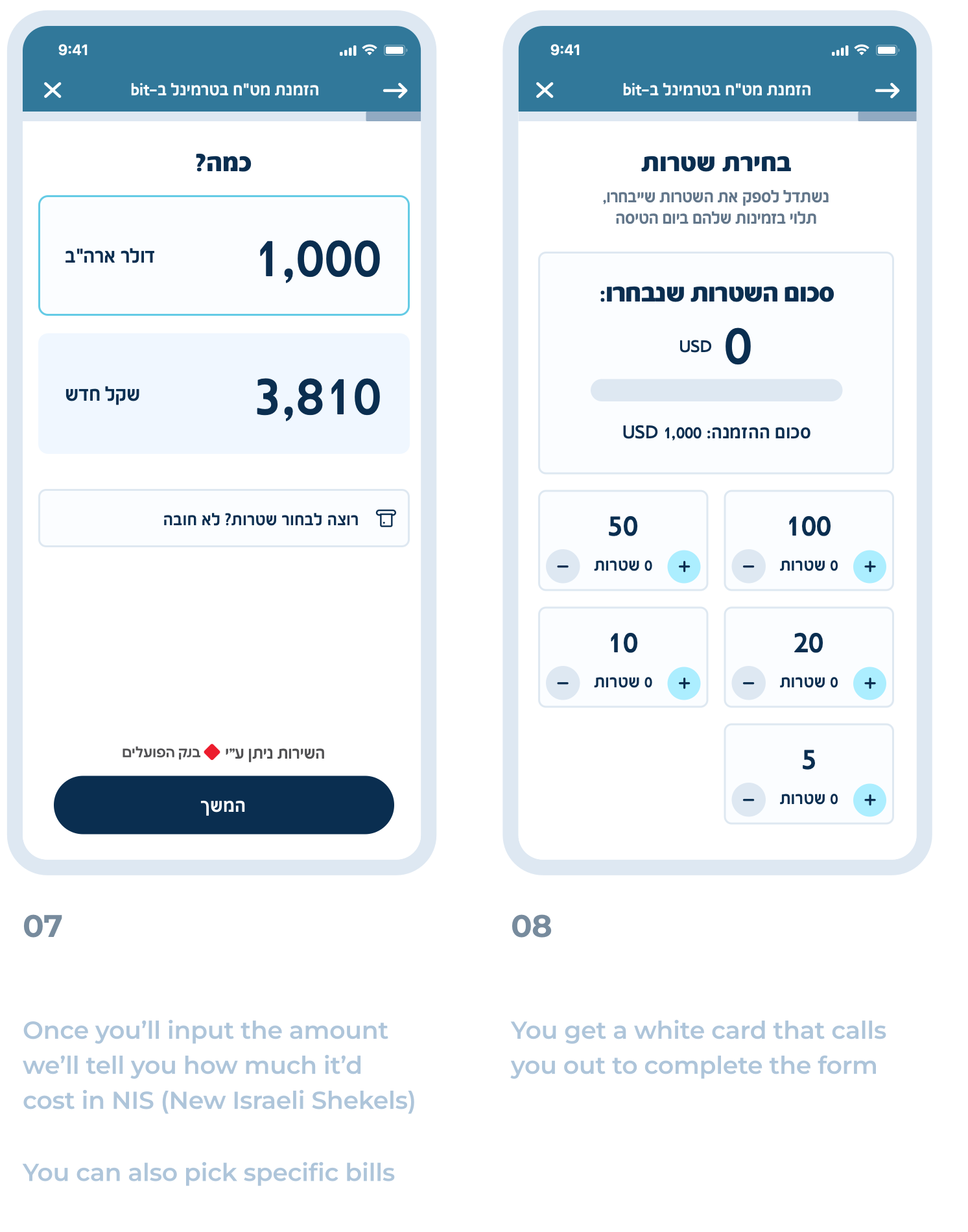
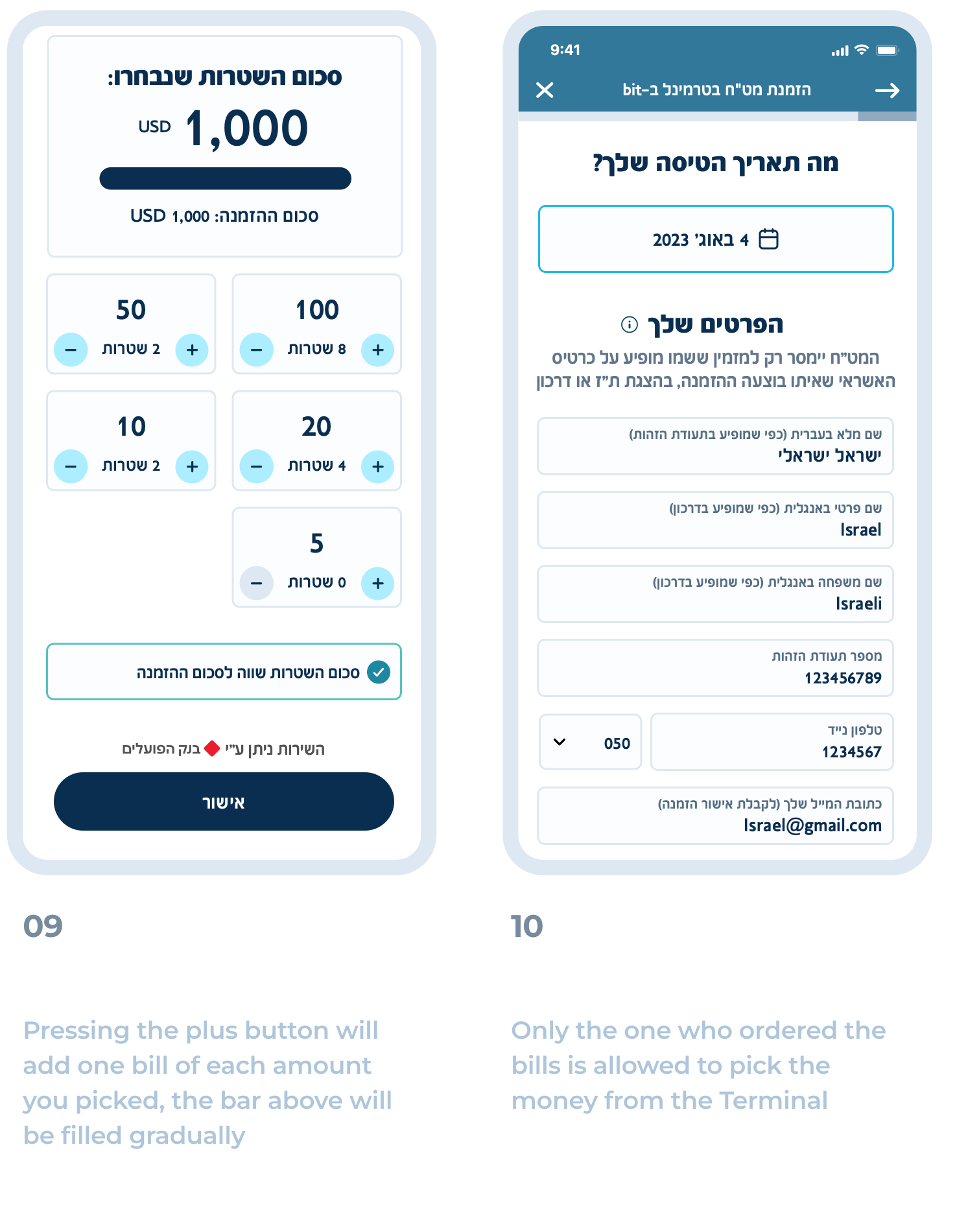
User Flow
use swipe \ arrow keys to see more
Challenges
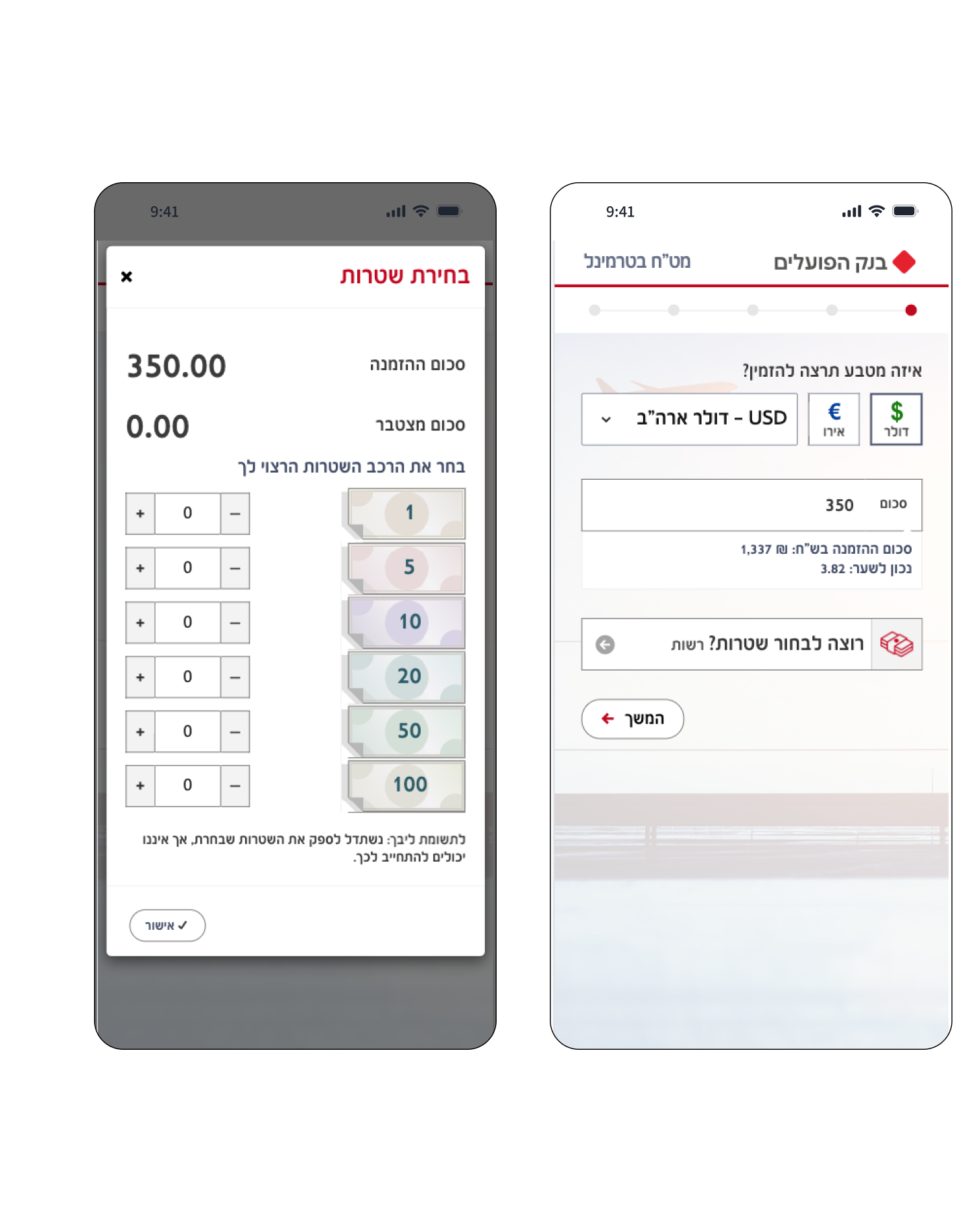
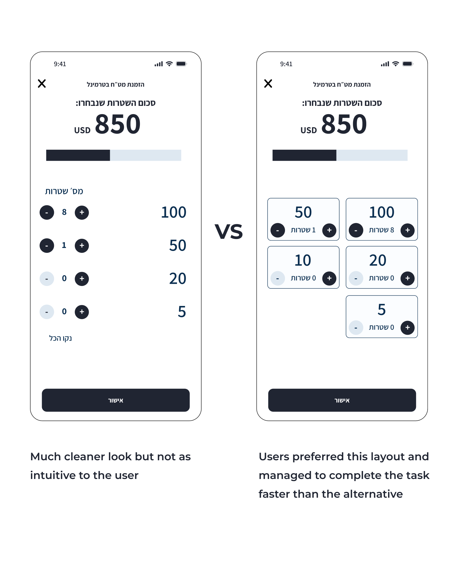
The majority of our testing groups encountered difficulty when selecting the bills they desired for their vacation.
To address this, I proposed two variations for selecting the bills to order. Initially, I assumed that most of our testing group would prefer a list format, but it turned out that the majority favored the layout with rectangles.
The rectangled layout helped them complete the task more quickly than the list layout.
Our target group consisted of individuals aged 20 to 65 with mixed gender
Building mini design system
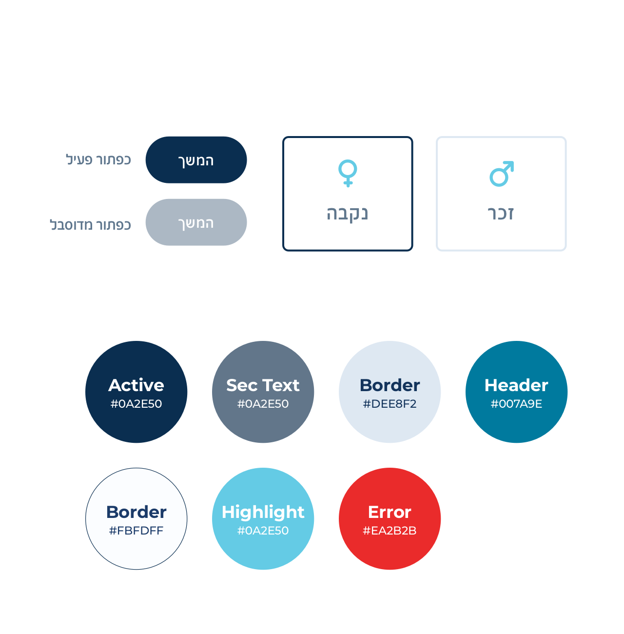
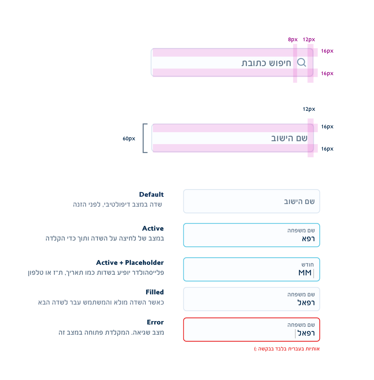
In order to be consistent we devised set of rules and component states that would act as an anatomy for our dev team.
The same was applied to illustrations & animations across the board.
This foundation will help us set in motion bigger changes we'd like to make down the road.
It also lowered development costs because we could use same components over & over.
There's an ad for it
Alright so we went all out with this new service by broadcasting it everywhere here's the bit Available on Youtubebut you can also
Needless to say it went viral & picked people's interest, it was quite a success in terms of sales (can't share the numbers, sorry).
Impact gauge
Results after launch
02:
Average Completion Time
High
Engagement Rate
Million customers
Round of applause
Amos Jerbi (UI, Illustrations & Animations)
Jonathan Bar (UX Lead)
+ Our dev team, Chapter Leaders, QA
Product Designer
BASED IN TEL AVIV
Hi, I'm Amos a father of two lovely children, passionate towards tech & embrace new challenges whenever they come.
I also have a Youtube channel.

