BANK HAPOALIM - 2021
BITCARD & WALLET
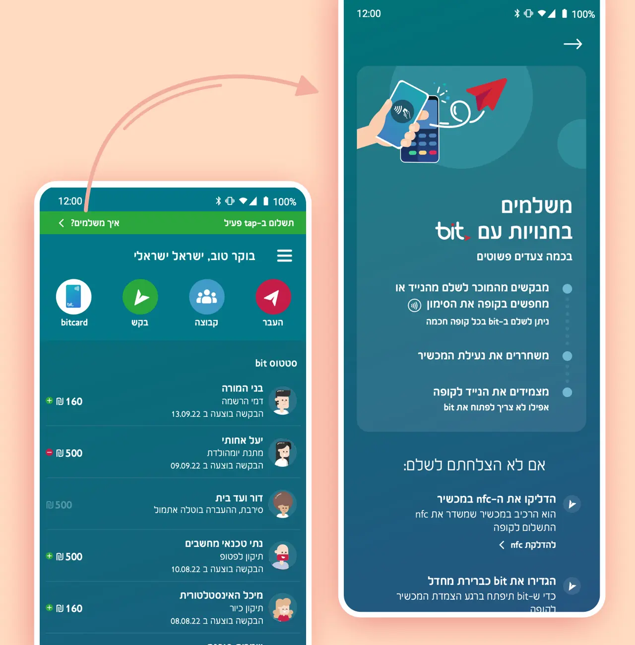
You can now pay by tap with your Android Phone
view bitcard in 3D on iOS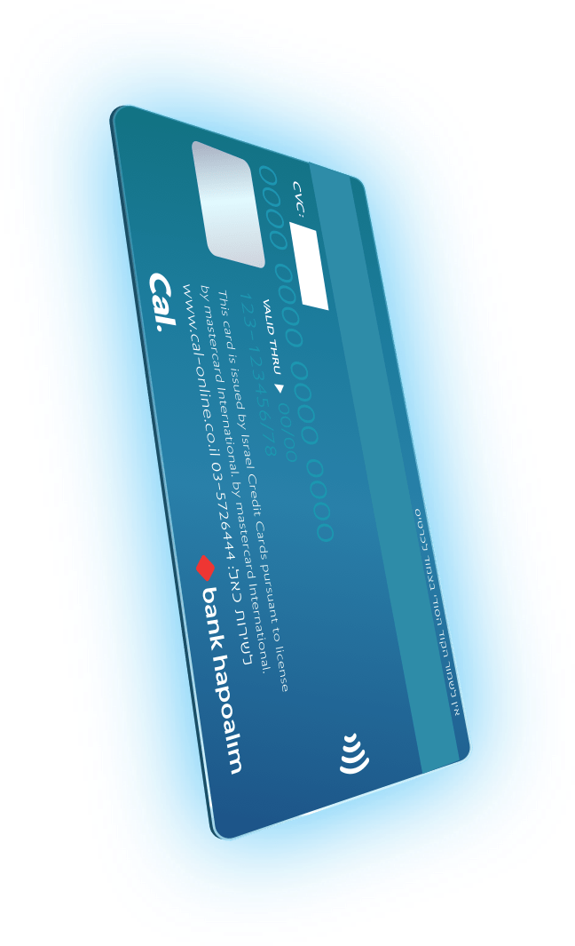
The Challenge
The rise of COVID19 made retailers & small business owners rethink how payments should be made so we came up with an idea to launch a new credit card that'll be added to a digitial wallet and allow tap to pay with your phone. Additionally, bit didn't have the functionality of adding multiple bank accounts and credit cards. Our time to market was short since an outside competition was imminent.
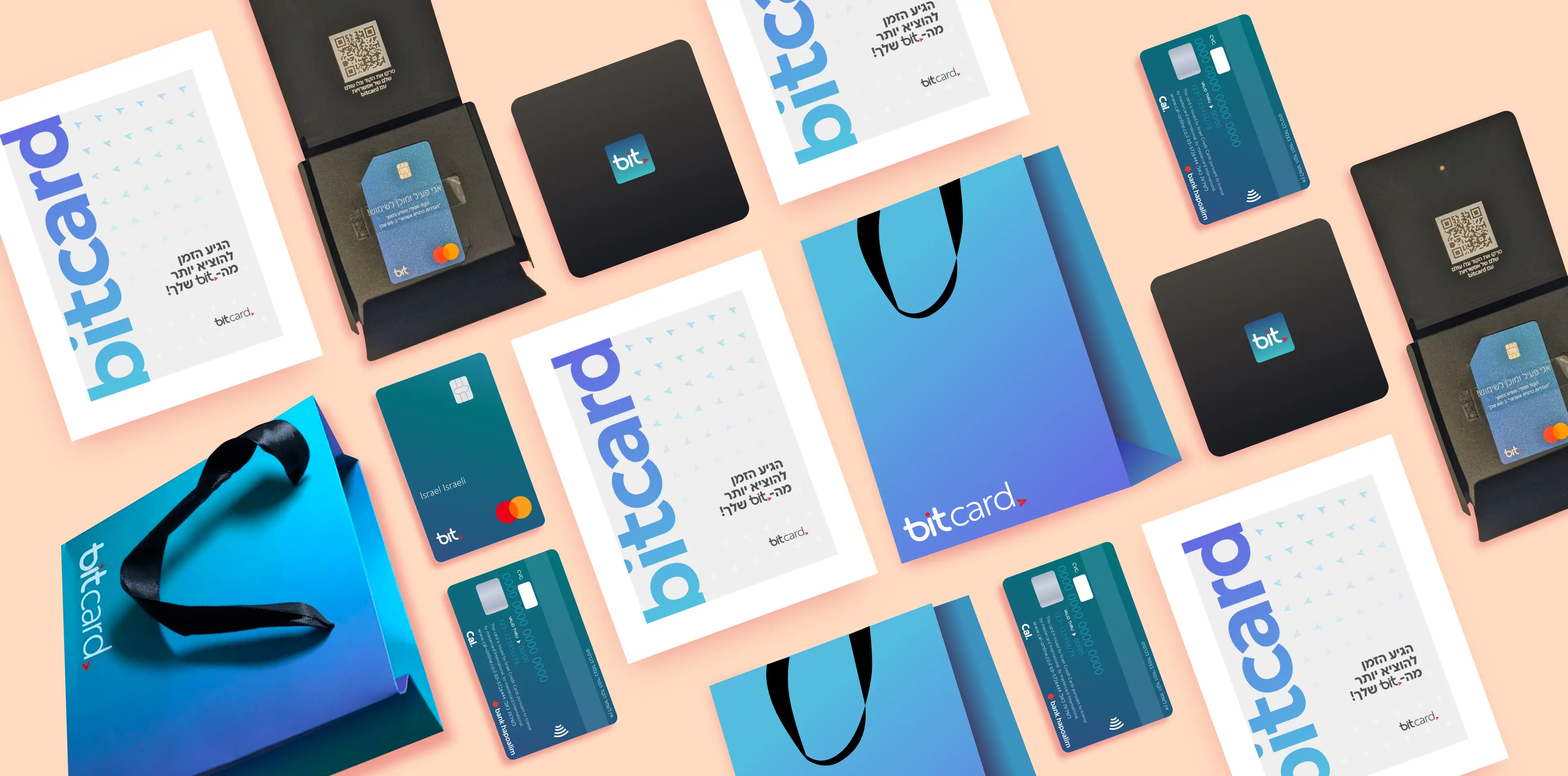
bitcard Branding
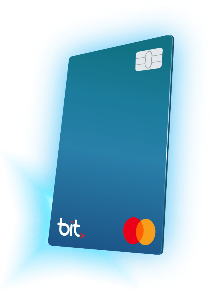
At first, there was a dicussion whether the card should be designed horizontally or vertically. After an extensive research we came to the conclusion that it should be vertical because all EMV devices at the point of sale were designed insert the card vertically.
We also wanted a minimalistic approach so I asked what could be removed from the front of the credit card. It was also important to maintain the same spirit of the bit app by communicating simplicity & elegance.
Ordering bitcard
Once you agree to order a bitcard a webview of Cal will open up and you’ll need to fill in your details, such as social security number, full name, address, profession etc in order to make sure you’re a real person.
When you finish this proccess you’ll be greeted with a screen that states “we’ve got it!” (it has an animation of a dog that winks). At that point we add that bitcard as token to your bit app & if your device has an NFC we encourage you to add it to a wallet
Activating your wallet!
After you’ve ordered your bitcard, you’d be prompted to add it to bit’s digital wallet. Only if you’ve got NFC that is, otherwise it won’t work.
We’ll ask for a phone permission so we could make a reading to the Point of Sale and if everything is A-OK you’ll get a green bar that’ll appear for 10 seconds indicating you’re good to go. In case you’ll need further help we’ve put a link within that green bar that explains it all through & through.
Prompts & Errors
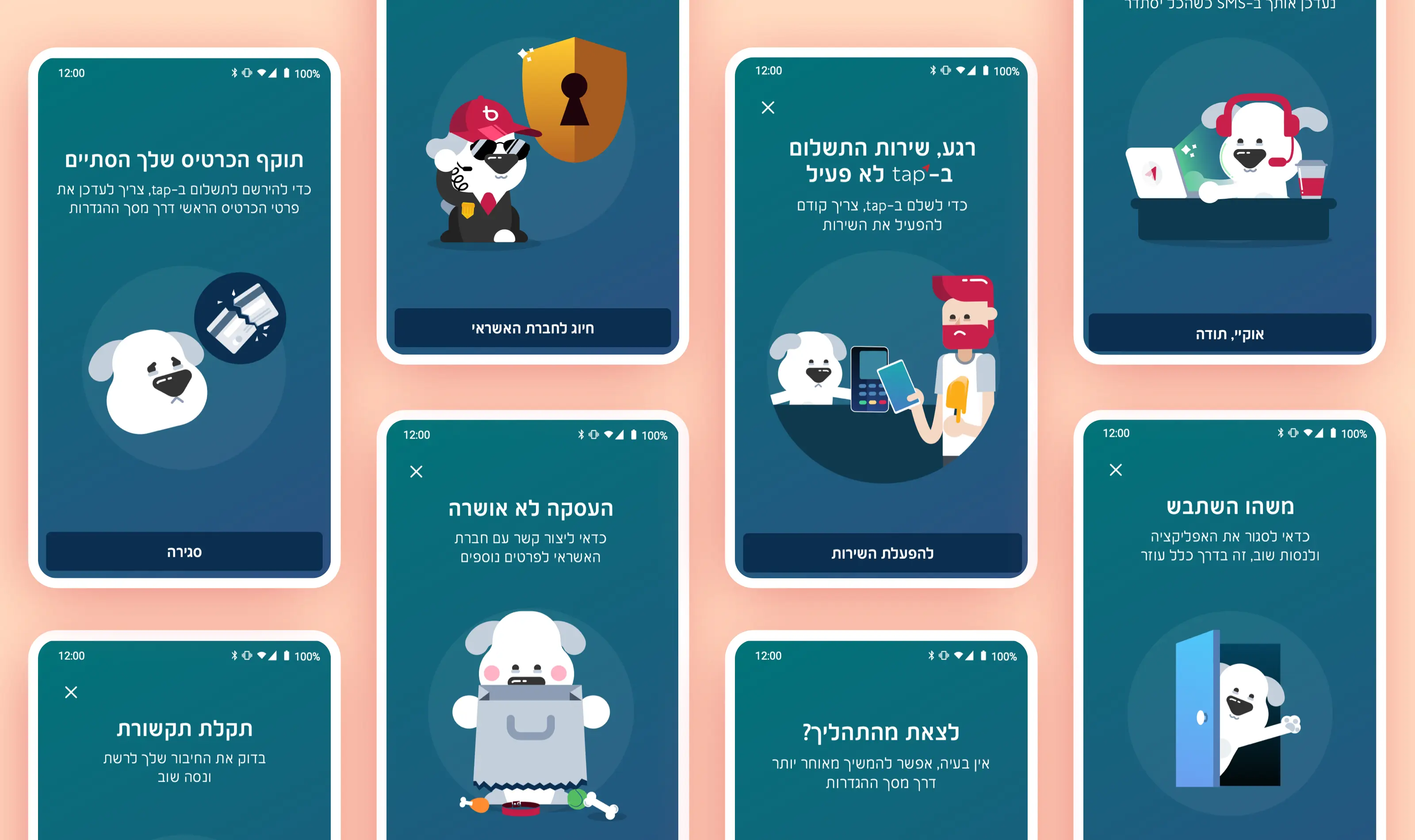
Whenever an error occured an illustration of a dog will explain the situation, the reasons were:
1. It’s unexcpected - the illustration briefly explains what went without even reading the message
2. It’s memorable - meaning a customer could understand what needs to be done next time it pops up, or when he/she call to call center & describe the illustration
3. Genderless - Aims to both sexs
How the Animations were made
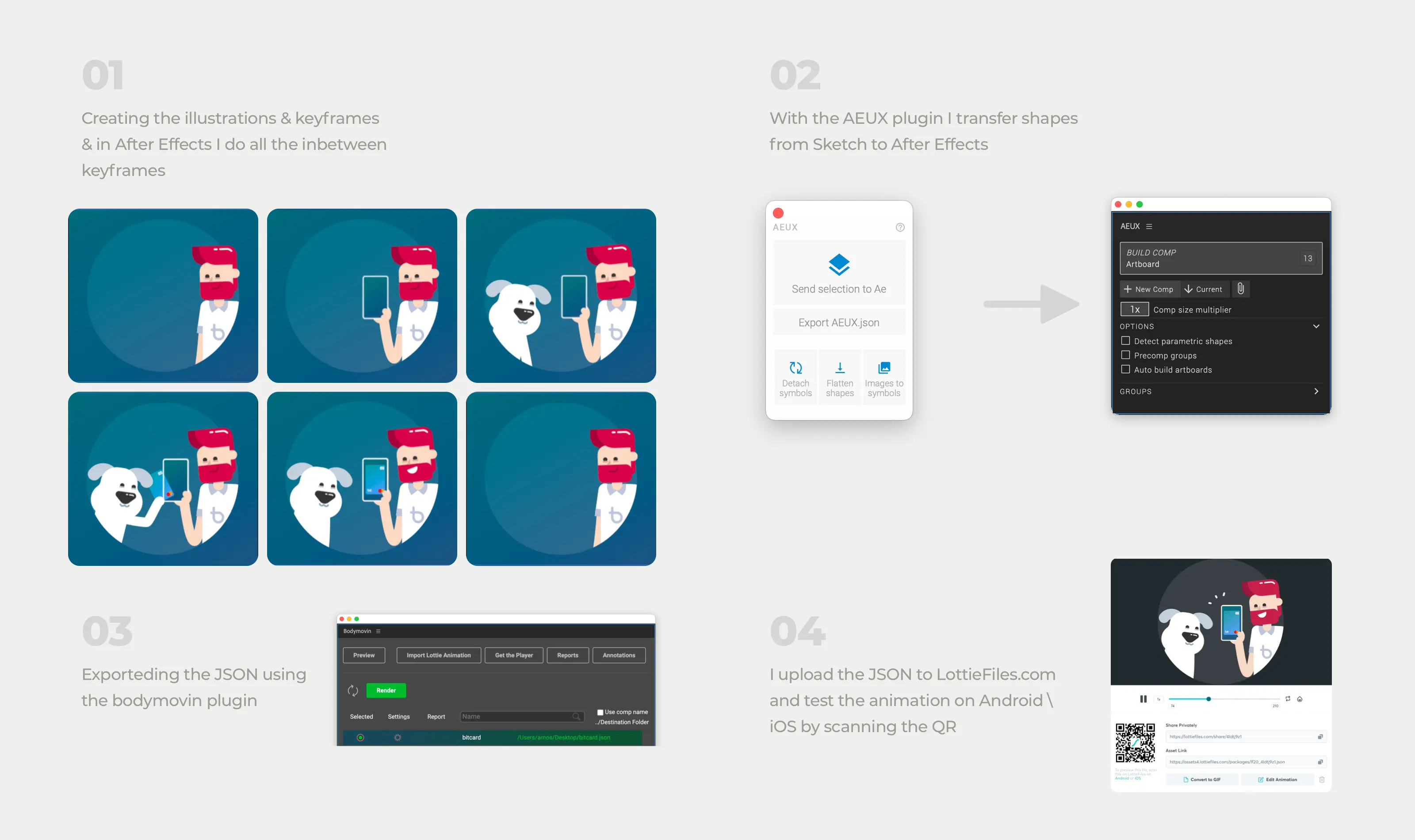
Animations aren’t a ‘nice thing to have’ they serve a purpose it’s either to explain something complex very briefly or delight our customers once they finished a proccess. Most of our animations are JSONS played by lottie, meaning they’re vectors and can be scalable. Run some certain keyframes in a loop etc.
1. Creating the illustration & keyframes.
2. With the AEUX plugin I transfer shapes from Sketch to After Effects.
3.Exported it all using the bodymovin plugin & test it on LottieFiles both on Android & iOS to check if we’re A-OK.
4. Once it’s up I scan the QR to see how if anything breaks on iOS & Android
Thanks & Credits.
High fives to all who were involved & hope to share with you more features as we push forward!
Amos Jerbi (UI, branding & Animations)
David Hazut (Head of bit's Product)
Shiran Gal (Product Manager)
Moran Ben Yehuda(Product Manager)
Evelyn Hadad (Product Manager)
Tal Solomon (CX Leader)
Itay Shhigger Zur (UX)
Ram Bracha (UX)
Lynn Alhadeff (UX)
& Our incredible dev team
Product Designer
BASED IN TEL AVIV
Hi, I'm Amos a father of two lovely children, passionate towards tech & embrace new challenges whenever they come.
I also have a Youtube channel.
