Overview
Making transactions between users (p2p) through a phone number became very common with the introduction of bit.
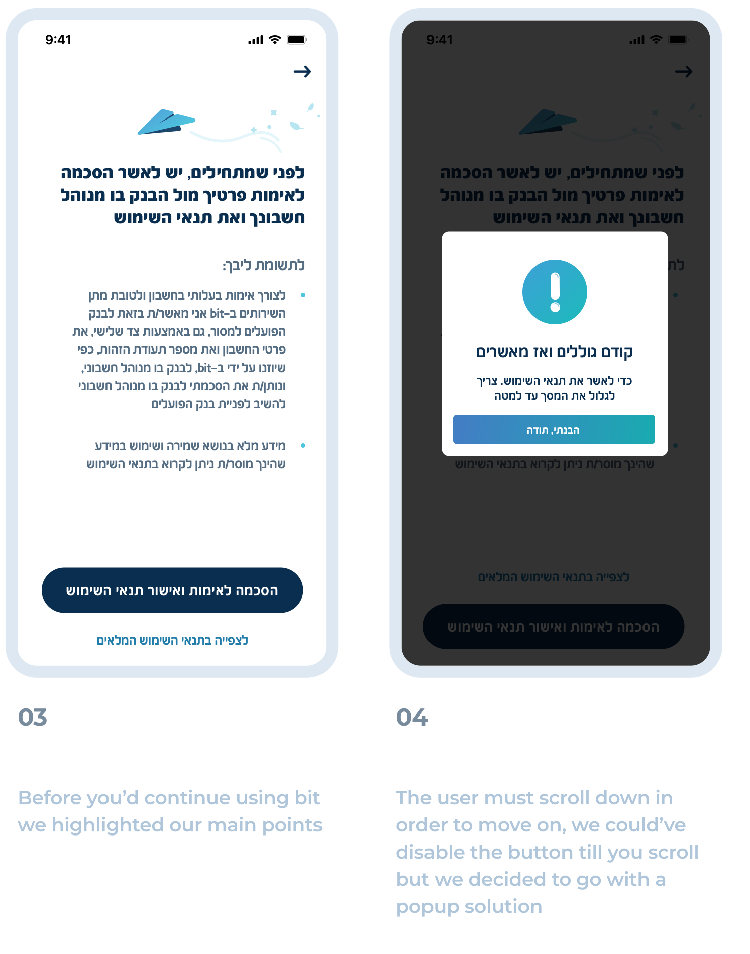
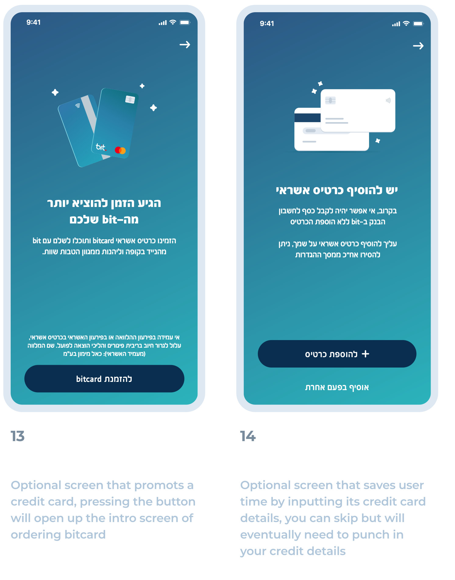
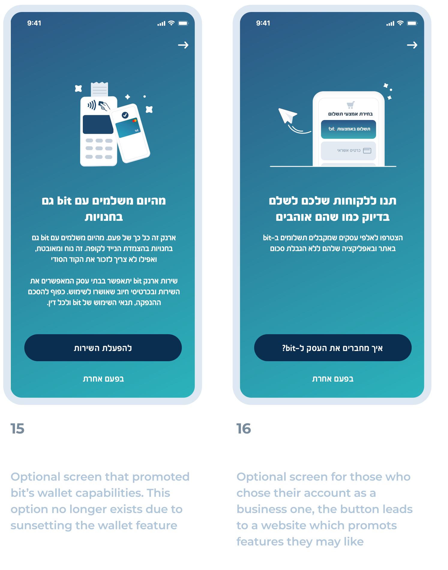
Everybody loved the new design language that was developed in 411 procedure so much so we also brought it over to our onboarding proccess to make a seamless experience
Research and Objectives
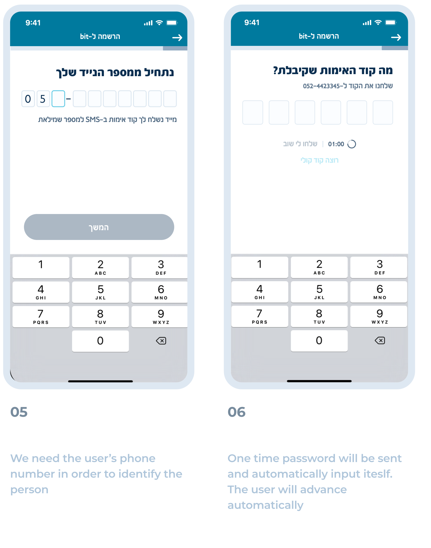
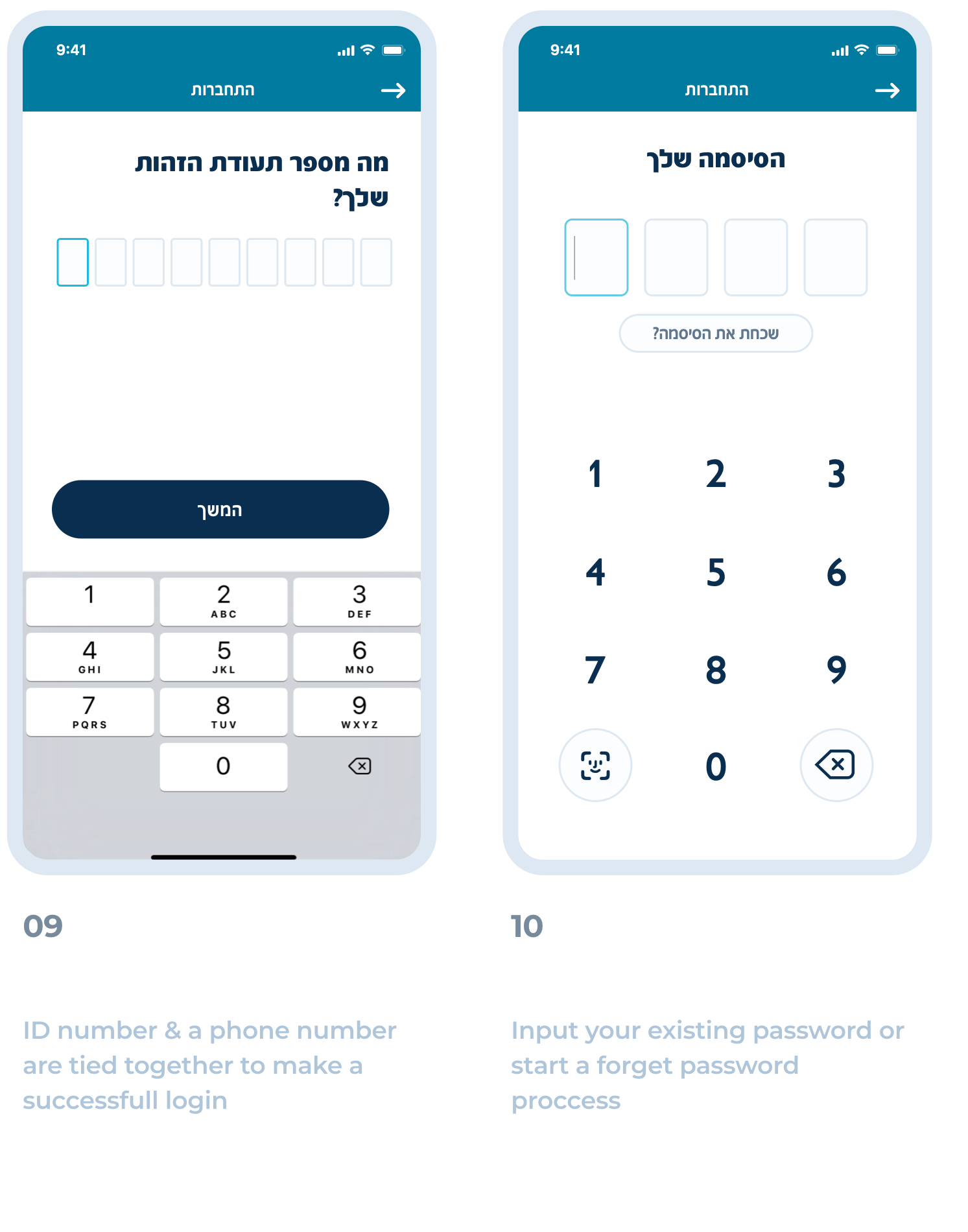
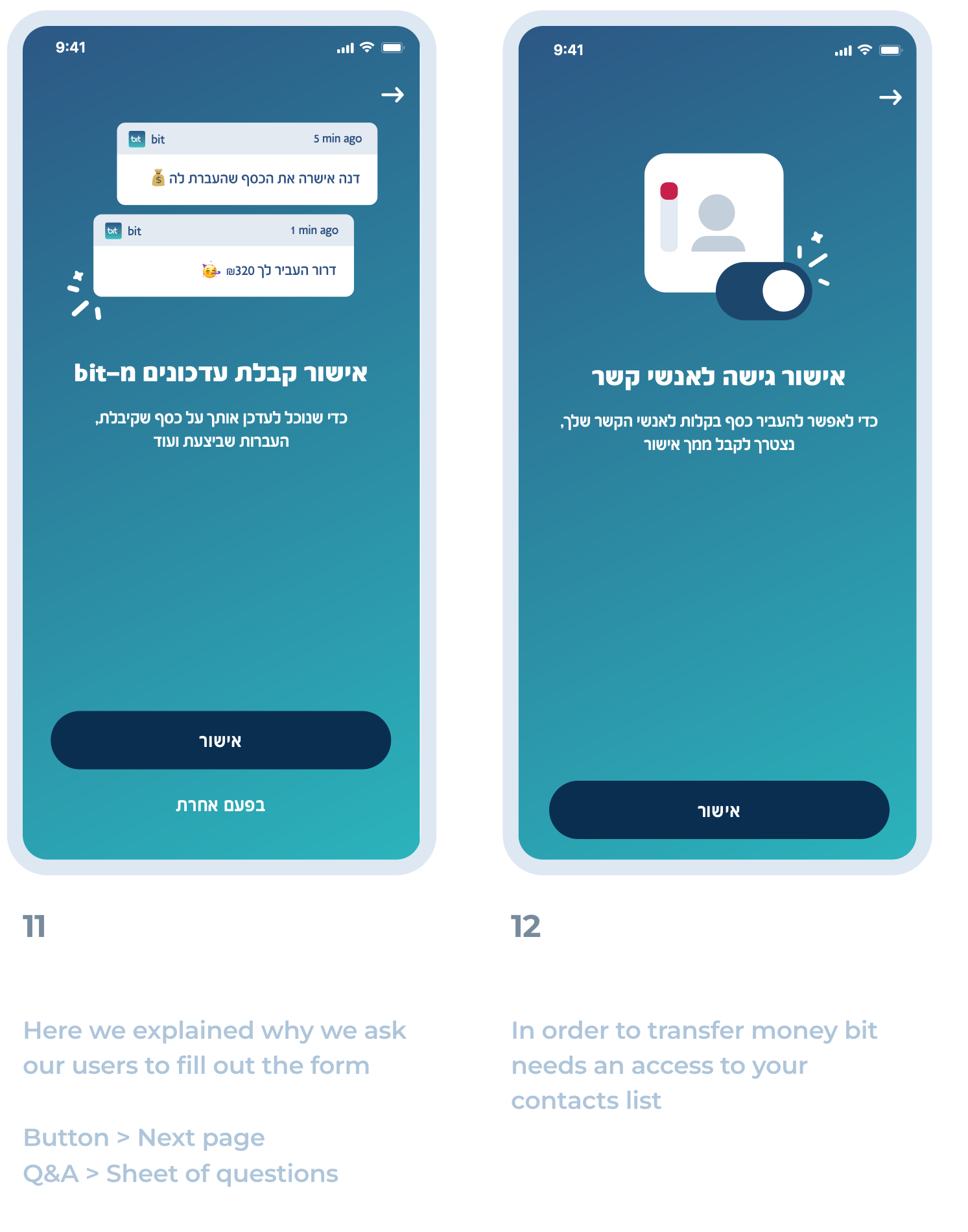
We decided to notable changes to our onboarding proccess so our customers could use bit ASAP
For that, we had the following objectives in mind:
1. Remove unnecessary screens
2. Bring concise terms & conditions since they change a lot
3. Giving precise microcopy instructions so our customer would know what to do next
Testing Prototypes
Upon our research findings we were greenlight to move in two directions
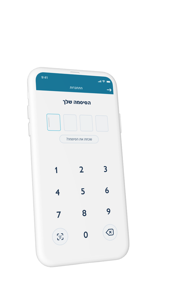
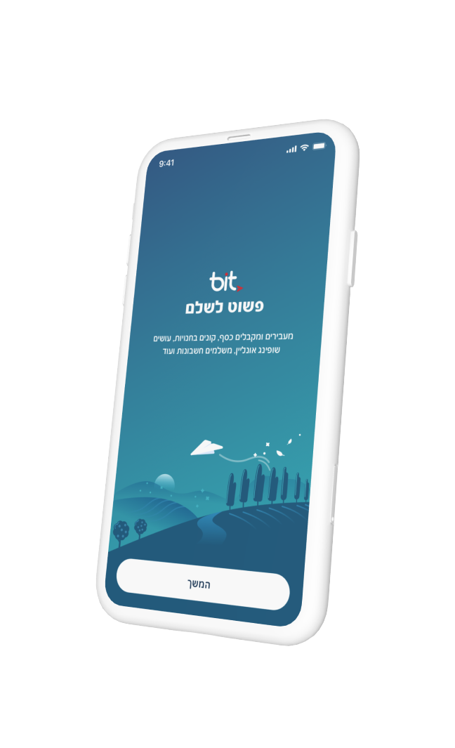
1. Styling all our onboarding proccess in 411 design system
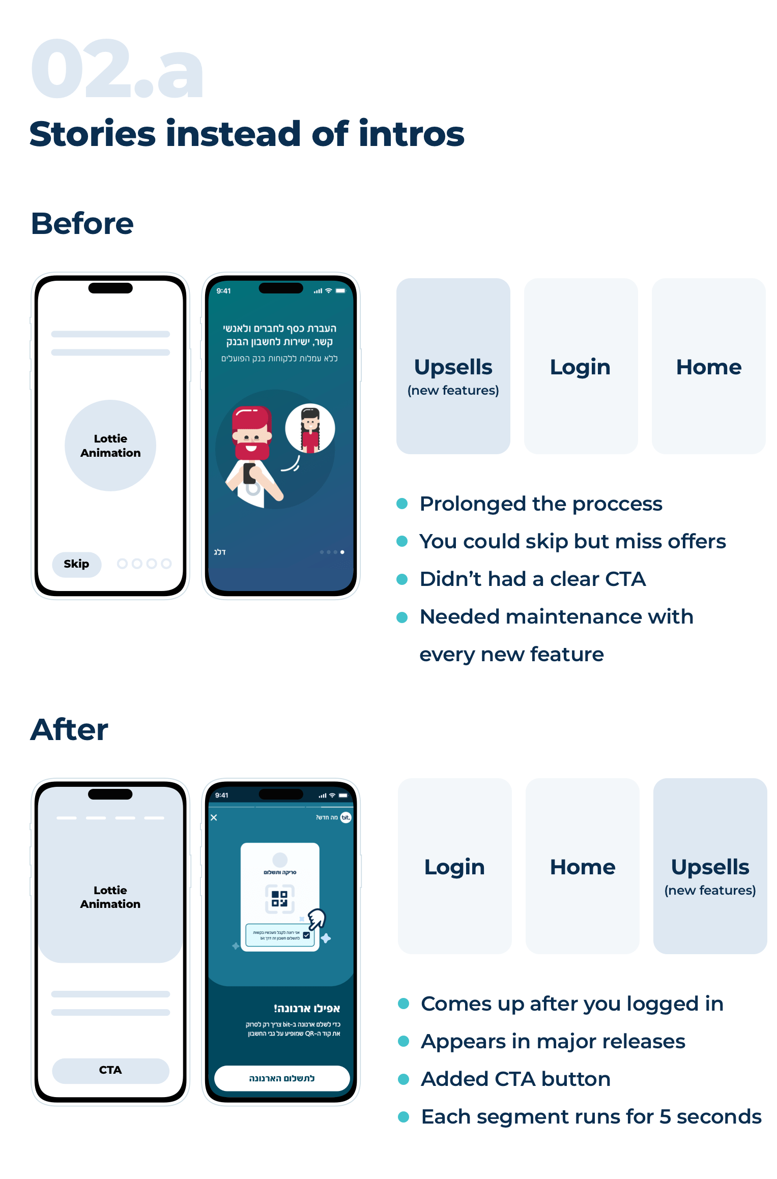
2. Creating stories in bit so users would be informed of new changes
User Flow
use swipe \ arrow keys to see more
Stories in bit!
Bit undergoes continuous evolution, regularly incorporating new features. To consolidate these updates in one accessible location.
We opted to transform them into stories allowing customers to focus on each feature!
Allowing users to navigate to the next one by pressing left or right with each segment lasting 5 seconds.
Upon updating bit stories will popup to tell what's new in this release, and there would a button in each story which will take the user to its place.
Impact gauge
Results after launch
00:
Average Login Time
High
Engagement Rate
Million customers
Round of applause
Amos Jerbi (UI, Illustrations & Animations)
Jonathan Bar (UX Lead)
+ Our dev team, Chapter Leaders, QA
Product Designer
BASED IN TEL AVIV
Hi, I'm Amos a father of two lovely children, passionate towards tech & embrace new challenges whenever they come.
I also have a Youtube channel.

